Long forms are not fun to fill out, but sometimes you need to collect a lot of data at one time. There is no way to avoid long forms completely, but we have some form building tips and tricks to help. These quick tips help users move through the form efficiently, so they save time, and you still get the data you need.
1. Chunk Information Into Sections
One of the best ways to make a form easier to fill out is to simply make the fields easier to understand and complete. A quick way to do this is by using sections.
You can add a section to your form by going to your form’s Build tab and looking in the left-hand options below the available fields. Here, you can see the option to add a section. Once you add a section, you can drag and drop the applicable fields into that section.
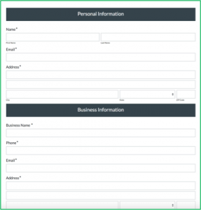
This helps the user easily see how much they have to enter for each type of data. It also helps break the form up so it doesn’t seem to be just a long group of data for them to enter.

Pro Tip: Using sections from the start during your form building helps you organize your form and makes moving fields around later much easier! We suggest starting with sections and then adding fields in.
2. Use Columns Thoughtfully
A quick thought when trying to reduce the size of the form is to use columns. However, not everyone reads columns the same way, and unless you set up the columns in an easy-to-view format, it can actually make the form harder and more confusing for your user to fill out.
Reading from the top down is easy to understand, but once you add columns, some users will think to start the form from the first column down and then the second, and others will automatically start reading from left to right on the page.
There is no quick fix because it depends on the data you are trying to collect, but a good tip if you want to use columns and reduce confusion is to use columns for some items and not others. This helps reduce space but also stops users from thinking to read down one column and then the other.
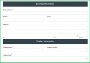
You can change how many columns one field will take. First, you will need to add columns, which you can do in the section settings (when you click on your section) or in the Form Extras area if you want the same columns throughout the whole form. Then, if you click on a specific field in the builder, you will see in the left-hand settings an option for “Column Span.”This allows you to choose how many columns a specific field takes up on the form.
3. Add Save & Resume and a Progress Bar
Formstack’s Save & Resume feature and the progress bar are popular options for long forms. If you have a multi-page form, you can add a progress bar to help users see how much more they have to fill out for the form.
You can add a progress bar in the Form Extras area of the builder. If you don’t have it as an option, you will need to make the form multi-page. You can do this by clicking on a section on your form and choosing the “Start New Page” option in the left-hand settings.
If your user sees in the progress bar that they have a ways to go and needs to leave the form, that’s when Save & Resume comes in. When you add the Save & Resume feature in the Form Extras area of the builder, it adds a link for “Save and Return Later” to the form. When users click this, it will save their current progress for 30 days in a link, and they can email that link to themselves when they click the button. They can then come back to the link and fill out the rest of the form later.

Pro Tip: File Upload fields are NOT saved when using the Save & Resume feature. Uploaded files will need to be re-uploaded when the user comes back, so we suggest putting these fields at the end of the form.
4. Expedite Completion of Duplicate Information
A huge help for filling out large forms is having an option for the user to not have to fill out the same data twice. If there is an option like this on your form, you can use the Field Autofill plugin. This option adds a checkbox to the form that will fill a field with data that is entered somewhere else.
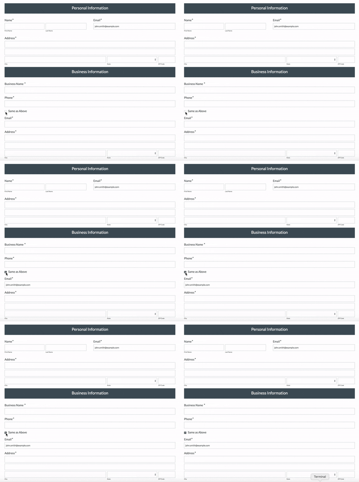
Commonly, this is used for billing address and shipping address, but it can be used for a variety of situations. Also, you can change the text from “Same as Above” to whatever you would like!
You can find this option in your form’s settings by navigating to Settings > Plugins > Field Autofill.
5. Try Field Bottlenecks
All the features above are available without an add-on, but if you have a form built and can’t figure out why users aren’t filling the whole form out, you may want to look into Formstack’s Conversion Kit. This add-on has a lot of features for taking a look at how users are interacting with your form, including A/B Testing, Partial Submissions and Field Bottlenecks—the latter of which is a good option for long forms.
It looks something like this:
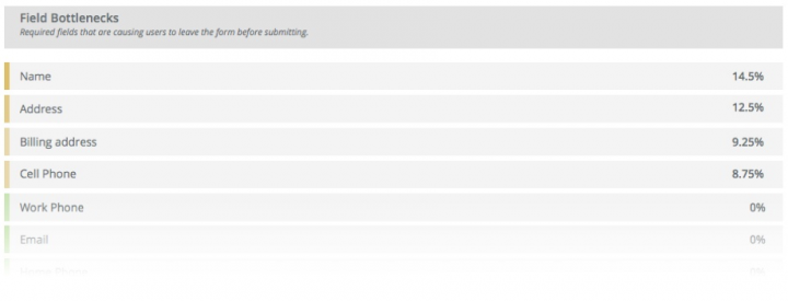
This feature allows you to see what field is causing users to abandon your form. It may be because they don’t want to provide that information, they cannot provide that information, or they’re confused as to what to provide. Turning on Field Bottlenecks can help you determine what pain points may be stopping your users from continuing on with the form.


